What are some of your favorite family entertainment center websites?
Do you take note of what makes them great and try to incorporate some of those creative ideas into your own facility website?
Whether you already have an incredible website or are just getting started, we can all benefit from some inspiration!
That's why today we're highlighting our top 5 favorite FEC websites and what we love about them!
5 Great FEC Websites Everyone Should Check Out
What makes a great FEC website? Well, it's a combination of great branding, great user experience, and effective calls to action.
Here's a list of 5 our team at PCS just so happened to design and what makes them stand out.
The Posh Play Cafe is a chic cafe and event space located in Chula Vista, CA.
We loved working with this client because they already had a brand kit developed for their business, which made it easy for us to choose the right theme, style, fonts, and colors for their website.
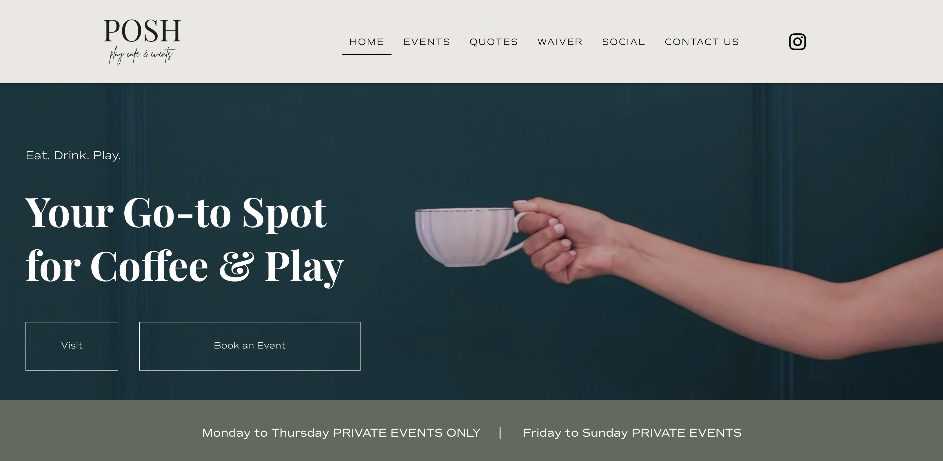
The website is elegant, easy to navigate, and includes several calls to action to book a party or event, sign a waiver, get a quote, and more. Why is this important? Well, without having to search for anything, the customer already gets their most pressing questions answered within the first few minutes on their homepage!
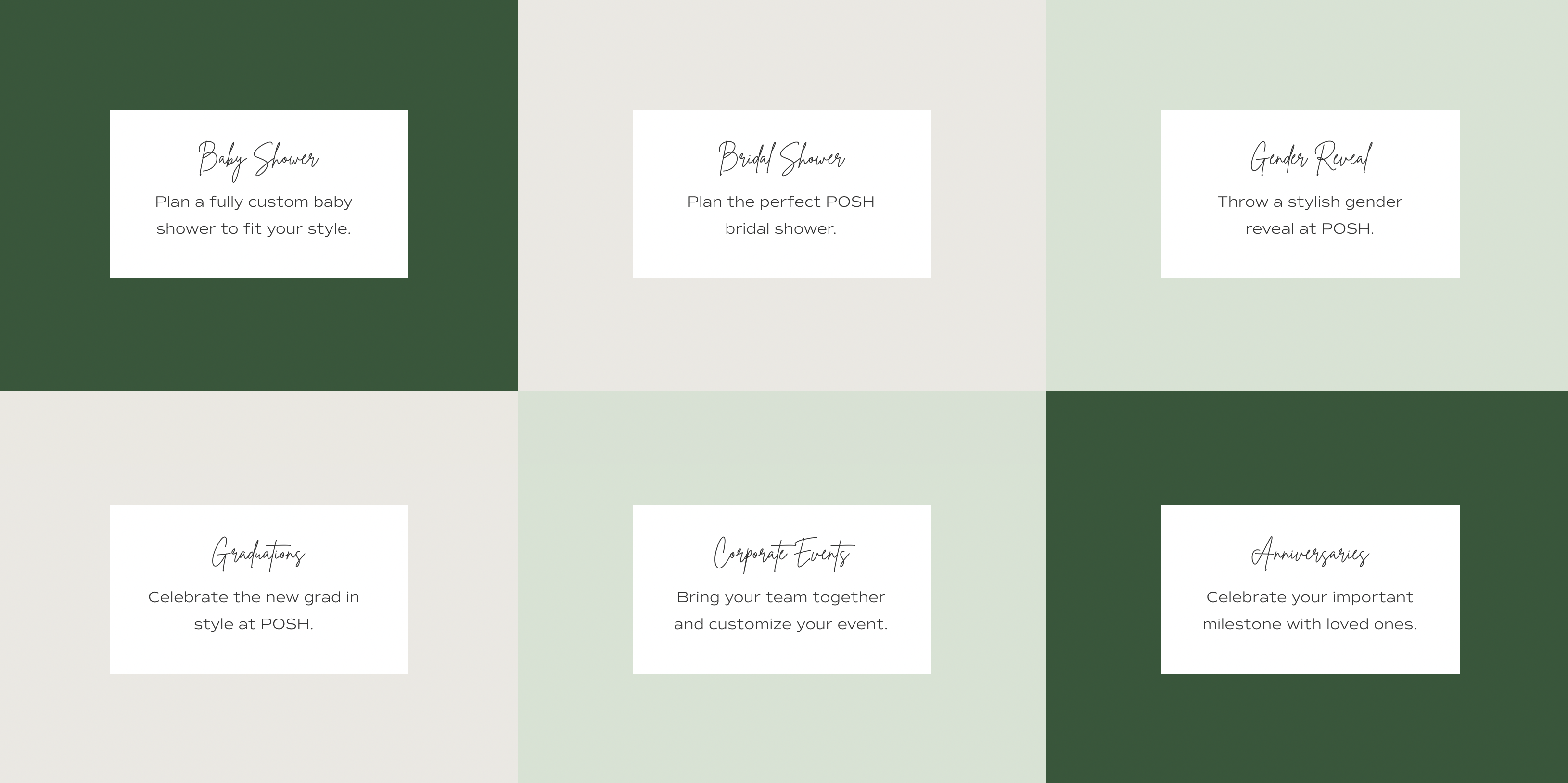
As they continue to go through the site, they're met with more detail on party packages and wonderful photos to get them excited about the experience.
The Playhouse is an interactive playground facility located in Alamosa, CO.
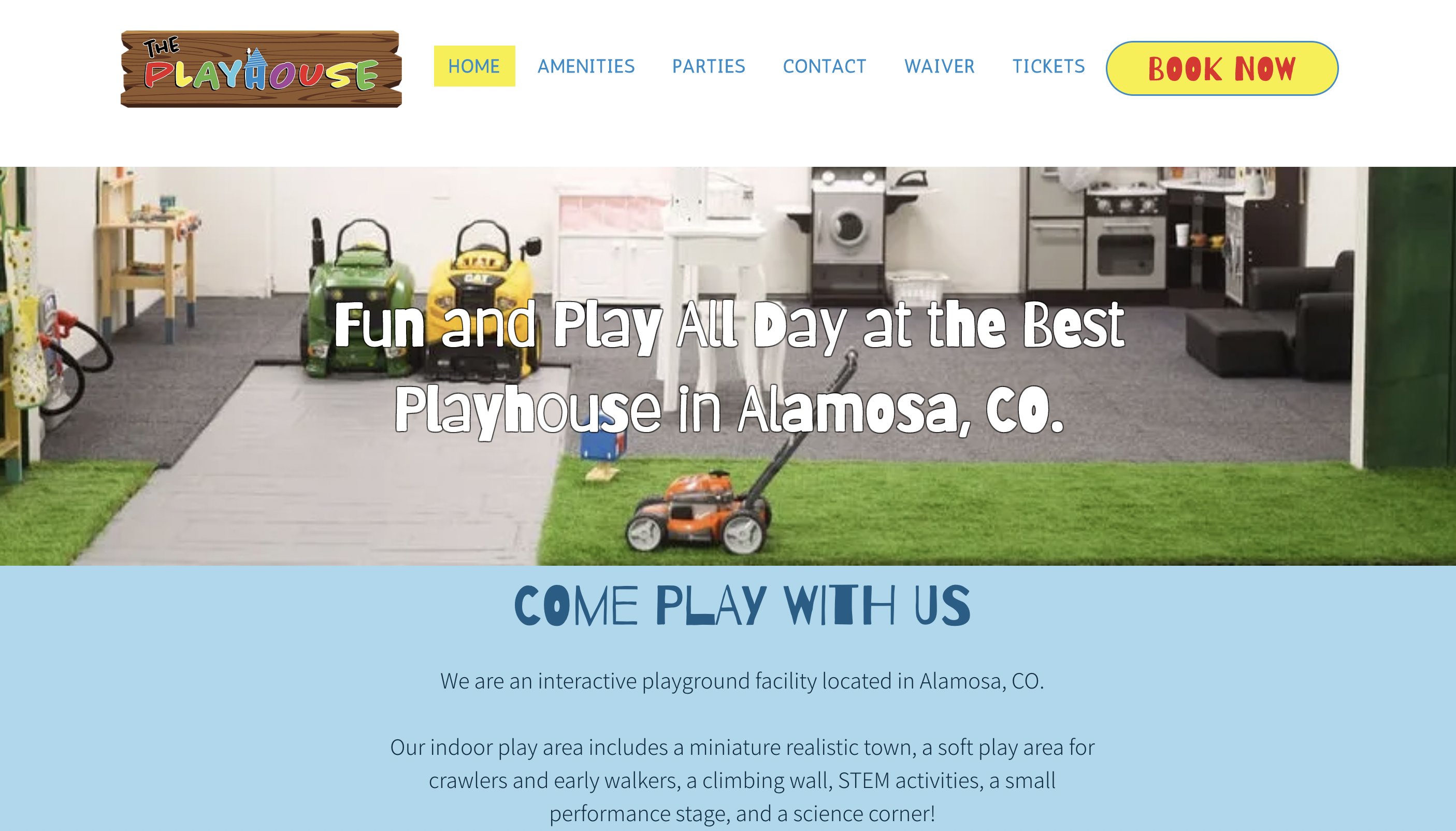
The homepage is fun, colorful, and depicts the sort of experience kids can expect to have at this facility. There are photos sprinkled throughout the site of their miniature town, soft play area, and more.
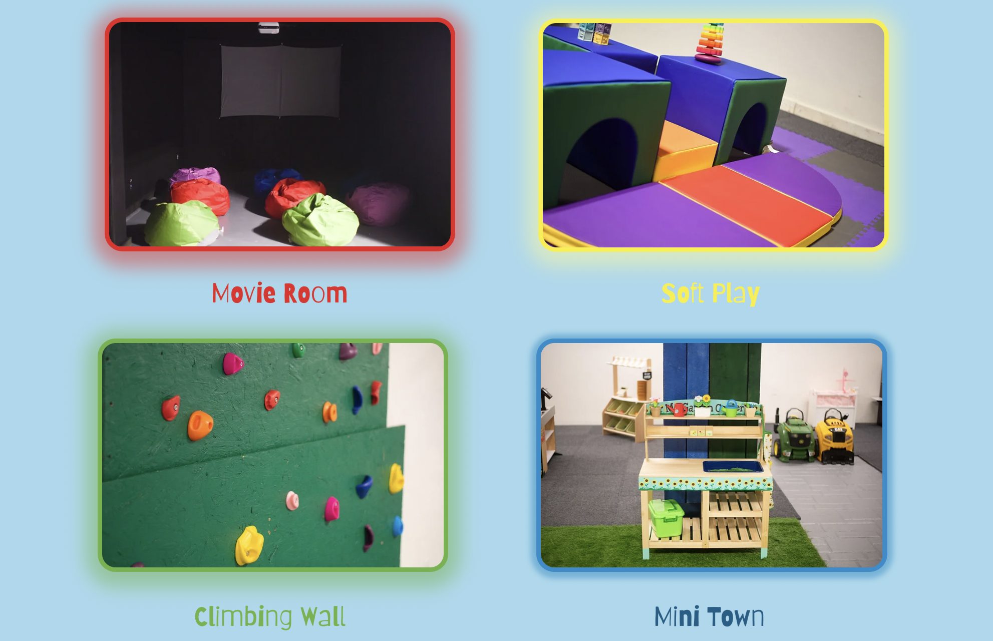
A picture says a thousand words, so having great photos on your site is critical!
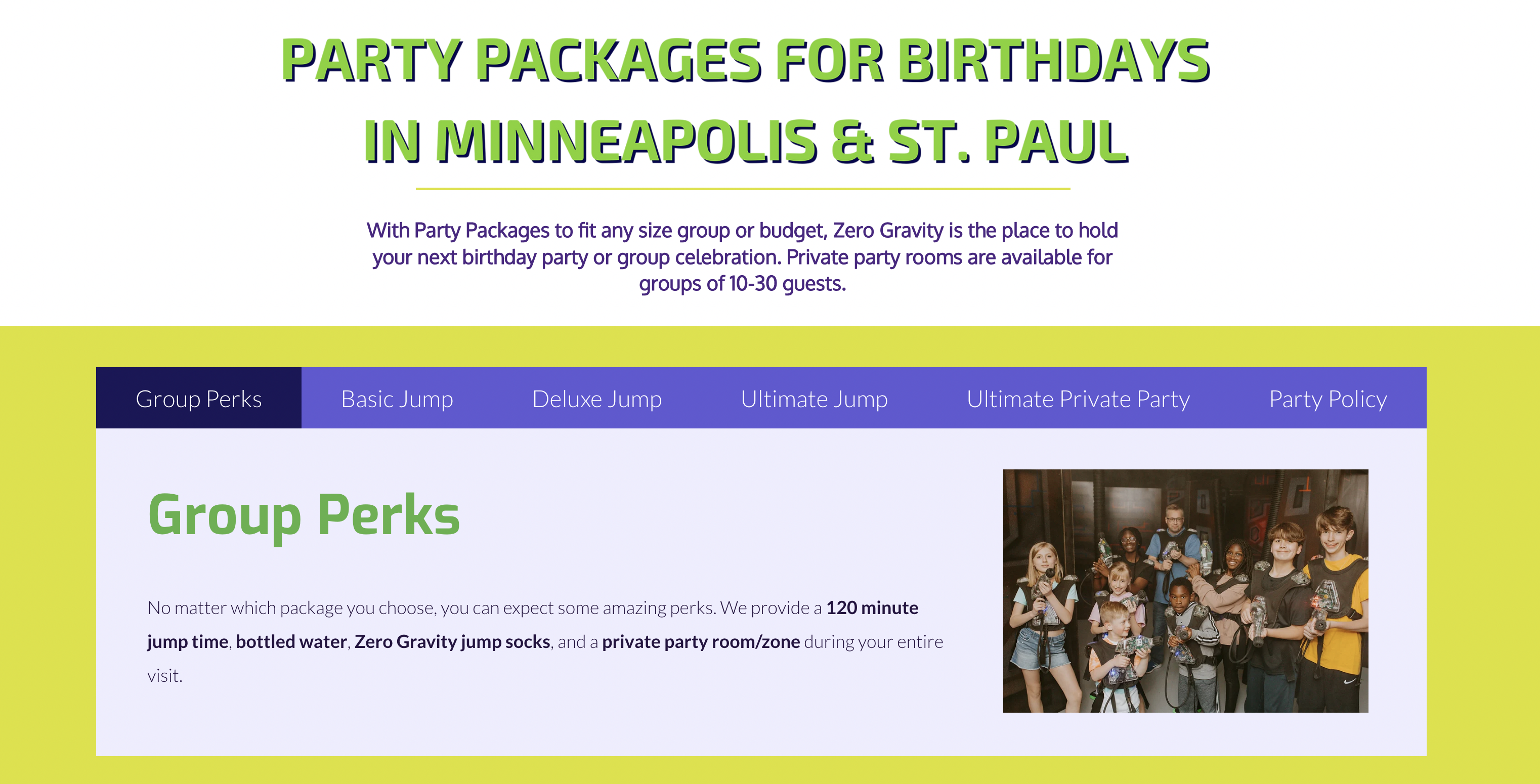
Zero Gravity Adventure Park is a multi-attraction indoor adventure park located in the Twin Cities.
Since this is a large facility with multiple party packages and attractions available, there's naturally going to be more information to share. Our mission was to condense their original site as much as possible and make it easier to navigate.
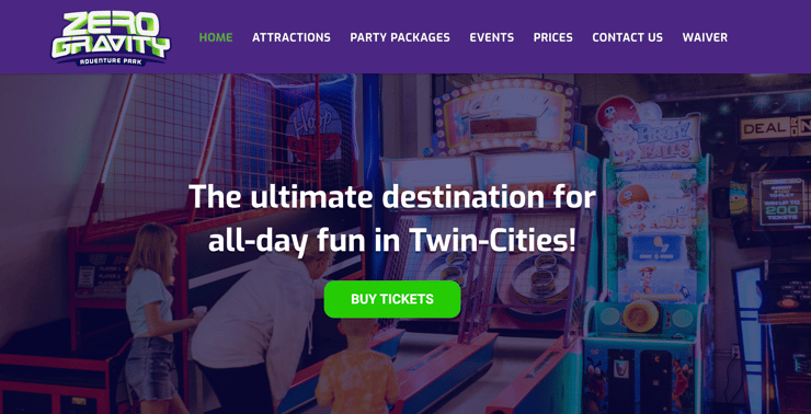
First, we love Zero Gravity's awesome pictures. They make a huge impression and immediately inspire you to plan a visit. We made sure to add plenty of pictures as well as galleries at the bottom of some pages to make it easier to see them all.
As mentioned, we also decided to build some modules that include detailed info on party packages, events, and more. These modules don't take up much space but allow the viewer to browse through different options without having to continuously scroll down.
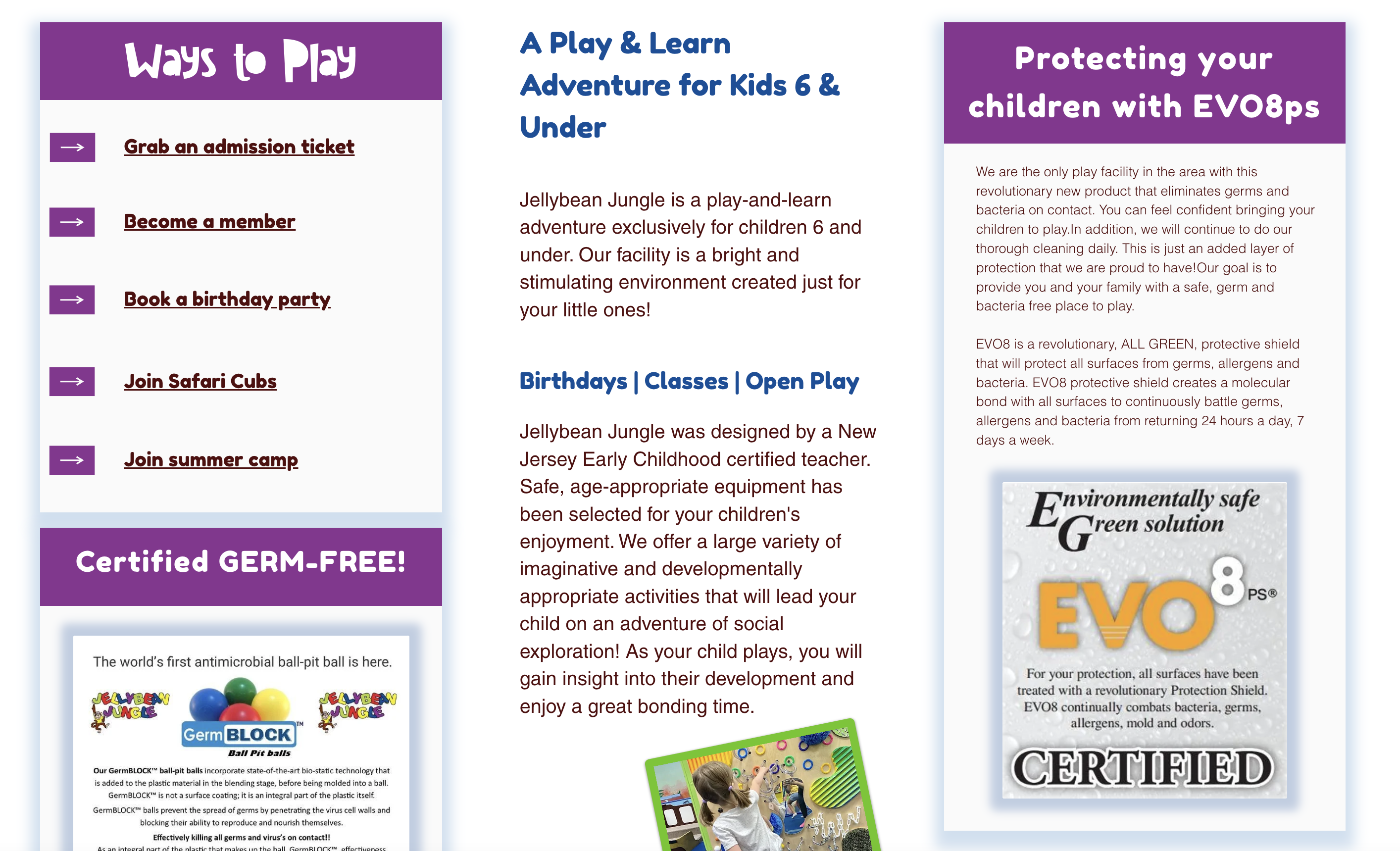
Jellybean Jungle is a play-and-learn facility for children 6 and under located in Evesham, NJ.
What we love most about this site is the added detail on safety precautions the facility takes to make sure it's germ-free. Parents definitely appreciate having this information right on the homepage.
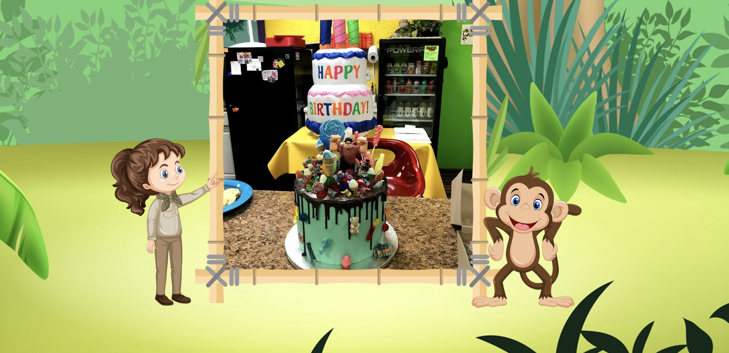
The fun colors and pictures of the site immediately inspire parents to book time for their kiddos. The mascots throughout are also a fun touch!
Jellybean's site includes information about their camps and group events, too. This is a great way for facilities to earn additional recurring revenue.
Ohana WonderTown Playground is an indoor play facility located in Allentown, PA.
This site is also playful and fun, with great photos to match.
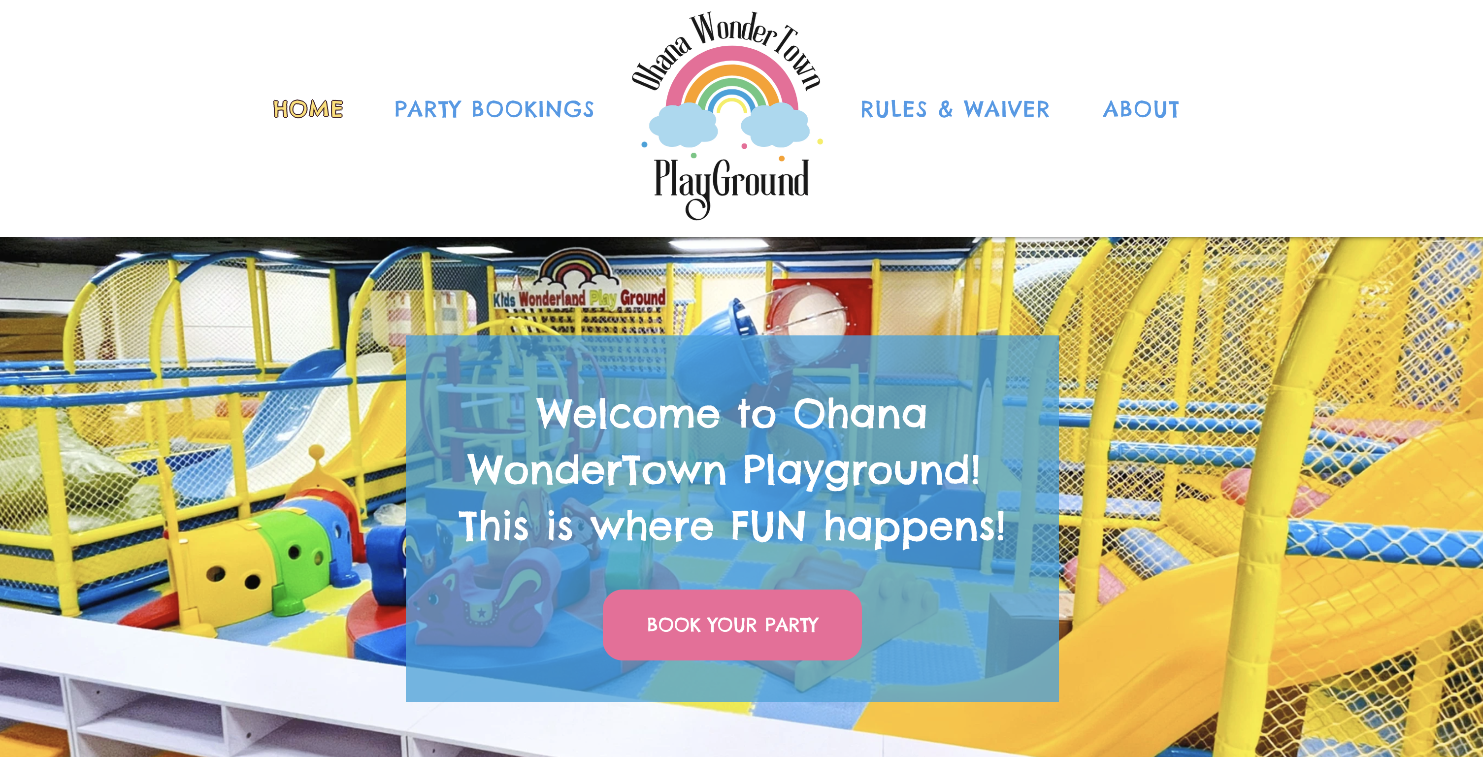
We love the About Us section that lets the viewer know this is a facility run by a mom of three. This is a great way to add a personal (and relatable) touch to the site!
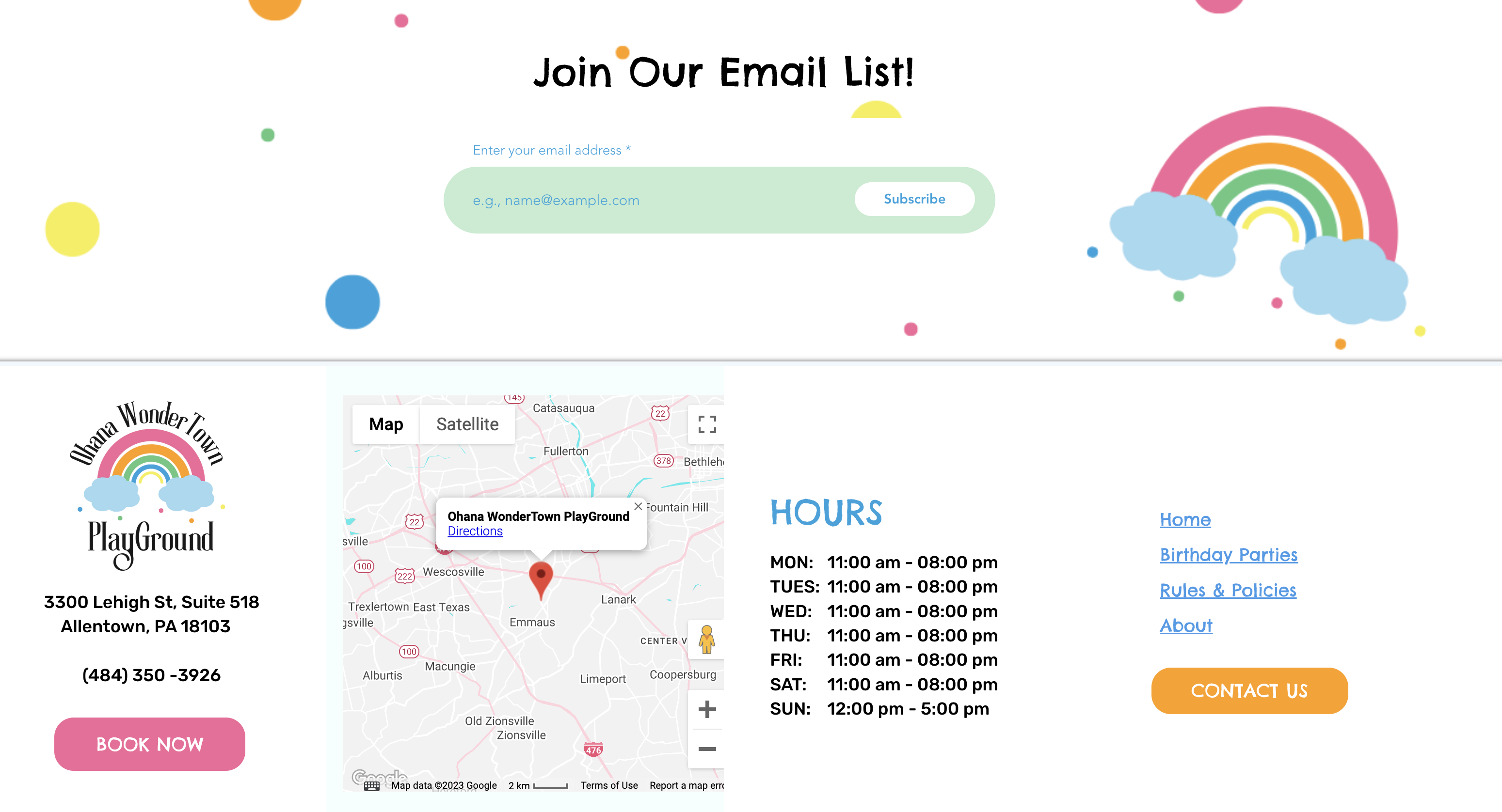
We also appreciate the email newsletter sign-up at the very bottom of the homepage. This is an easy way to collect customer data and nurture potential customers via email moving forward.
The websites above remind us that it's imperative to clearly show and explain what attractions are available at your facility. You can use certain color palettes to create a distinct brand identity. You can also use images or videos to show people how your facility is going to make them feel.
Perhaps most importantly, we learn the importance of improving the user experience on your website by making it easy to navigate.
The goal of your website is to turn interested prospects into paying customers. In order to achieve that goal, your site must translate all the joy and fun that your facility offers!
We hope that these examples will help you turn your website into a productive sales & marketing asset.
Leave a Comment, We'd Love to Hear Your Thoughts!
What do you think about the websites I shared? Do you have any plans to improve your website this year? Let me know in the comments below!