Although it might seem like branding is all about aesthetics, it’s actually much more than that.
You see, your website is not only a visual representation of your brand, but it also illustrates the sort of experience your customer might expect to have at your facility.
If your website is poorly designed, slow to load, unattractive or inconsistent, customers will click off and find something else to do that weekend. A bad website equals a bad experience in the customer’s mind.
Hard to believe? Here are some interesting statistics:
Best Website Branding Advice for FECs & Event Venues
Branding your website doesn't have to feel like rocket science. Start by asking yourself:
- What experience are your customers looking for?
- What are your offerings? What are the benefits associated with your party packages or experiences?
- What problems do your customers have that your facility will solve? For example, busy working moms don’t have time to plan and organize a party for their child. So they might look to your facility to make the process easy. What do you offer to simplify her party-planning experience?
When you answer the questions above, you will already have started the process of outlining the uniqueness of your brand.
What is Branding?
Let's take a step back for a moment.
Branding gives your business a voice.
In other words, branding expresses what you offer and what problems you solve for your target customers. For example, if the kids are bouncing off the walls at home and mom or dad had a hard day at work and doesn’t want to cook dinner, your FEC feeds AND entertains the family that’s looking to just get out of the house. That’s your brand! You help families make memories and have fun.
Apart from listing descriptions of your attractions, packages, and pricing, you can also communicate your unique brand identity through certain colors, fonts, your logo, and pictures or videos of your facility. Visuals allow you to better express the values and intentions you have as a business.
Create visual branding that is attractive, unique, consistent, and memorable.
Think about some of your favorite brands, like Coca-Cola or Nike. What makes those brands stand out?
For one, both are consistent. They use consistent color palettes and fonts because that allowed these businesses to grow their brand recognition. They’re also consistent in terms of their product or experience - you know what you’re getting, and it’s great every time! The consistency in product or experience is illustrated by their equally consistent look.
Next, they’re unique and attractive, they’re different from their competitors in terms of colors and product and both have a polished, refined look. They’ve also integrated themselves into people’s lives through commercials and pop culture. This contributes to both becoming memorable, trustworthy brands.
Research shows that up to 85% of consumers believe color is the biggest motivator when choosing a particular product, while 92% acknowledge visual appearance as the most persuasive marketing factor overall.
Think about this: if you’re an indoor play center for children, you’re likely marketing to moms and dads.
What do they want to see in your brand? Well, they probably want to know that you operate a fun but safe facility. They also want to be able to trust you with their children and know that their experiences at your facility will be memorable.
How can you portray that visually? Well, you can choose bright and energetic colors to show you’re fun for kids ages 5 and up, or you can use muted and neutral colors to push a calmer experience, perhaps for toddlers. By choosing the right color palette, you express your uniqueness as a brand.
Furthermore, you can become trustworthy by asking for and including testimonials on your website and by also sharing photos and videos of children having fun at your facility, so that parents can see the environment that their kids will have a lot of fun in if they visit!
By remaining consistent with your choices, and making sure that parents see the facility before they visit, you actually suggest that you’re a safe, stable, and fun environment for children.
Branded Visuals
We all know the phrase, a picture says 1000 words.
As mentioned in the section above, visuals are incredibly important. They tell a story!
We all prefer to “see” an experience before we decide to do it ourselves, so posting great pictures of your facility (and more importantly, posting pictures of people having fun AT your facility) is critical when your goal is to attract prospective customers.
When it comes to photos of your facility, we don’t recommend a less is more approach. Instead, include pictures of every attraction you offer so potential visitors can get a feel for what your facility has available. One of the most common questions we’ve observed in local mom groups on Facebook is age-related questions.
- “Is this place appropriate for a 1-year-old?”
- “Is there anything for a 3-year-old to do?”
- “What age group will have the most fun at this facility?”
- “I have a 2-year-old and a 9-year-old, what is there to do for each age group?”
Keep this in mind as you design your website. Consider sharing photos and including text that makes it clear how your facility will be enjoyed by visitors of varying ages.
When it comes to taking great pictures, it’s not as difficult as you might think! All you really need is a phone that allows you to take high-quality pictures, or a high-quality camera, and a quick lesson on the rule of thirds (which enables you to take better photographs).
What’s better than a picture? Video.
Check out these stats:
Needless to say, recording a video of your facility is another great option and you can share this video on both your website and social media.
Check out our video on How to Shoot a Video of Your Facility Using Your Phone here.
Language & Details
Be sure to use motivating, authoritative language on your website that emphasizes your benefits and addresses your target customer directly.
For instance, use phrases like:
- We are the only facility with [insert feature] in the [insert location] area.
- Here are 10 reasons why you should visit us this weekend.
- Book now.
- Don’t miss out on this opportunity.
Don’t be afraid to get detailed. Include clear descriptions of your party packages, pricing, and rules and guidelines on your website.
Now more than ever, customers want to know about your cleaning and sanitizing process, capacity restrictions, and hours of operation or re-opening status, so make it easy for your customers to find this information.
In addition to this, be sure to provide a detailed outline of other policies on your website, such as your refund policy. This is incredibly important as it can ensure you retain, at minimum, a part of the deposit if the customer cancels their party within just a few days of the event. It also allows you to minimize the impact of chargebacks.
In short, including detailed information on your website can and will protect your business and inform the customer that they are making a commitment to you and must respect your policies.
Leave a Comment, We'd Love to Hear Your Thoughts!
What did you think about the branding tips in this post? Let us know in the comments below!
NEW RESOURCE
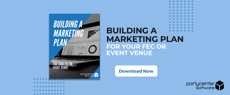
Effectively marketing your FEC or event venue doesn't have to feel like rocket science.
In this eBook, you'll discover:
- How to build a better website that'll grow your business.
- How to create digital content that'll attract your target customers.
- How to motivate customer engagement through experiential marketing.
- How to track marketing data for growth.
If you'd like to learn more, click on the image below to download a copy of this complimentary guide!

Let's Connect!
We want to connect with you on social media so we can serve you best. Follow us on Facebook, Instagram, Twitter, and LinkedIn, and we'll follow you back!
